

In today’s competitive e-commerce landscape, a seamless and intuitive user experience is paramount to success. Effortless navigation is a cornerstone of a positive user experience, directly impacting customer satisfaction, conversion rates, and ultimately, your bottom line. This article provides simple tips to enhance your online store’s user experience, focusing on optimizing your website’s navigation for increased engagement and sales. By implementing these straightforward strategies, you can transform your online store into a user-friendly platform that encourages exploration and drives conversions.
From streamlined menus and effective search functionality to clear product categorization and intuitive filtering options, optimizing your online store’s navigation can significantly improve customer engagement. This guide will delve into practical and simple tips to make navigating your website effortless for your customers, enabling them to quickly find the products they seek. Improving your user experience through enhanced navigation not only increases customer satisfaction but also encourages repeat visits and fosters brand loyalty. Discover how to empower your customers with a seamless browsing experience, maximizing the potential of your online store.
Understanding the Importance of Seamless Navigation
In the competitive landscape of e-commerce, a seamless navigation experience is paramount to success. It directly impacts user engagement, conversion rates, and ultimately, your bottom line. A frustrating navigation experience can lead to abandoned carts and lost customers, while a well-designed one fosters a positive user experience, encouraging exploration and purchase.
Intuitive navigation allows customers to quickly and easily find what they are looking for. When customers can effortlessly browse your products and access information, they are more likely to complete a purchase. This translates to increased sales and improved customer satisfaction.
Furthermore, seamless navigation contributes to a positive brand perception. A well-organized and easy-to-use website reflects professionalism and attention to detail, building trust and credibility with your customers. This positive first impression can be crucial in converting casual browsers into loyal shoppers.
Finally, clear navigation improves website accessibility for all users, including those with disabilities. A well-structured site with clear labels and logical pathways benefits everyone and ensures a positive experience for all potential customers.
Creating a Clear and Intuitive Menu Structure
A well-organized menu is the backbone of a user-friendly online store. It acts as a roadmap, guiding visitors to the products or information they seek. A confusing or cluttered menu can lead to frustration and lost sales. Prioritize clarity and simplicity when designing your menu structure.
Categorize products logically. Group similar items together under broad categories, and use subcategories where necessary for more specific filtering. Avoid excessive nesting of subcategories, which can make navigation cumbersome.
Use concise and descriptive labels for menu items. Avoid jargon or internal terminology that customers may not understand. Keep labels short and to the point, making it easy for users to scan and find what they’re looking for.
Consider using a mega menu for stores with a large number of products. Mega menus allow you to display multiple subcategories and even featured products within a single dropdown, providing users with a comprehensive overview of your offerings.
Optimizing Your Site Search Functionality
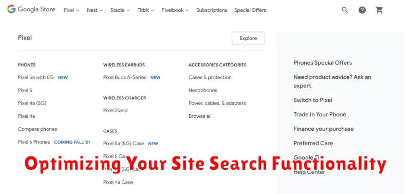
A robust site search is crucial for a positive user experience. Customers rely on search to quickly find specific products within your online store. Optimizing this functionality directly impacts sales and customer satisfaction.
Implement autocomplete suggestions. As users type, offer relevant product suggestions. This speeds up the search process and reduces typos. Consider displaying product images alongside suggestions for better visual identification.
Support natural language processing. Allow customers to search using everyday language, rather than forcing them to use specific keywords. For example, a user searching for “blue running shoes” should see results for “men’s blue running shoes” or “women’s blue athletic footwear.”
Offer faceted search options. Enable users to refine search results by filtering based on attributes like size, color, price range, and brand. This empowers customers to narrow down their choices efficiently.
Handle misspellings and synonyms. Implement a search algorithm that tolerates common misspellings and recognizes synonyms. This ensures that users find relevant results even if they make a typo or use a different word than what’s listed in your product description.
Implementing Breadcrumbs for Easy Navigation
Breadcrumbs are a powerful navigational tool that significantly enhance user experience by showing users their current location within your online store’s hierarchy. They provide a visual trail, allowing customers to easily understand where they are and how they got there. This clear path boosts user confidence and reduces frustration, especially in complex websites with multiple categories and subcategories.
Effective breadcrumb implementation involves a hierarchical link trail, typically placed near the top of the page. Each level in the hierarchy should be clearly labeled and clickable, enabling users to quickly jump back to previous categories. For example, a breadcrumb trail might look like this: Home > Clothing > Men’s > Shirts. This allows a user browsing “Shirts” to quickly return to “Men’s” or “Clothing” with a single click.
Key benefits of using breadcrumbs include improved findability of products, reduced bounce rates, and a streamlined user journey. They empower users to explore your online store with confidence, knowing they can always easily retrace their steps.
Designing User-Friendly Product Category Pages
Well-designed product category pages are crucial for a positive user experience. These pages serve as the primary gateways to your products, so making them intuitive and easy to navigate is essential.
Logical categorization is the foundation of a user-friendly experience. Group similar products together in a way that makes sense to your customers. Consider how shoppers typically search for items and organize your categories accordingly.
Effective filtering and sorting options empower users to quickly find what they’re looking for. Provide filters based on relevant product attributes such as size, color, price range, and brand. Offer sorting choices like price (high to low, low to high), popularity, and newest arrivals.
Clear product displays with high-quality images and concise descriptions enhance the browsing experience. Ensure each product listing provides essential information, including price, availability, and key features, without overwhelming the user.
Using Visual Cues and Filters to Aid Navigation
Visual cues play a crucial role in guiding users through your online store. Clearly defined categories and subcategories, highlighted by distinct typography and spacing, make browsing intuitive. Employ visual hierarchy, using size and color to emphasize important elements like sale banners or new arrivals.
Filters empower users to refine product searches efficiently. Offer a variety of filtering options based on relevant criteria such as price, size, color, brand, and customer ratings. Ensure filter selections are clearly displayed and easily adjustable. Faceted navigation, which allows users to apply multiple filters simultaneously, greatly enhances the browsing experience by narrowing down results precisely.
Consider using icons to represent categories visually, further enhancing the browsing experience. A well-placed search bar is also essential, providing users with a direct route to desired products. Keep the search function prominent and ensure it offers auto-suggestions for common queries.
Mobile Optimization for Seamless Navigation on All Devices

In today’s mobile-first world, ensuring your online store offers a smooth and intuitive navigation experience on all devices is paramount. A mobile-optimized website is no longer a luxury, but a necessity.
Responsive design is key. Your website should adapt seamlessly to different screen sizes, from smartphones to tablets and desktops, providing a consistent user experience. Elements like menus, buttons, and images should resize and rearrange automatically to fit the device’s dimensions.
Minimize page load times. Mobile users are often on the go and expect quick loading speeds. Optimize images, streamline code, and leverage browser caching to ensure a speedy experience. A slow-loading site can lead to frustration and lost sales.
Simplify navigation menus. Avoid cluttered menus on mobile. Consider using a hamburger menu or a simplified tab bar to streamline navigation and make it easy for users to find what they’re looking for. Prioritize essential navigation elements and avoid overwhelming users with too many options.
Testing and Refining Your Navigation for Optimal Performance
Testing your online store’s navigation is crucial for ensuring a smooth user experience. Various methods can provide valuable insights into its effectiveness.
Usability testing involves observing real users as they navigate your site. This provides firsthand feedback on pain points and areas of confusion.
A/B testing allows you to compare different navigation structures or elements. By presenting variations to different user groups, you can determine which performs best in terms of conversions and engagement.
Heatmaps and click tracking tools visually represent user behavior on your site. These tools reveal which navigation elements are frequently used and which are overlooked, guiding optimization efforts.
Analytics data, such as bounce rates and time spent on page, can also indicate navigation problems. High bounce rates on key pages might suggest users are struggling to find what they need.
Regularly analyzing and refining your navigation based on this data ensures it continues to meet the evolving needs of your customers and contributes to a positive online shopping experience.